
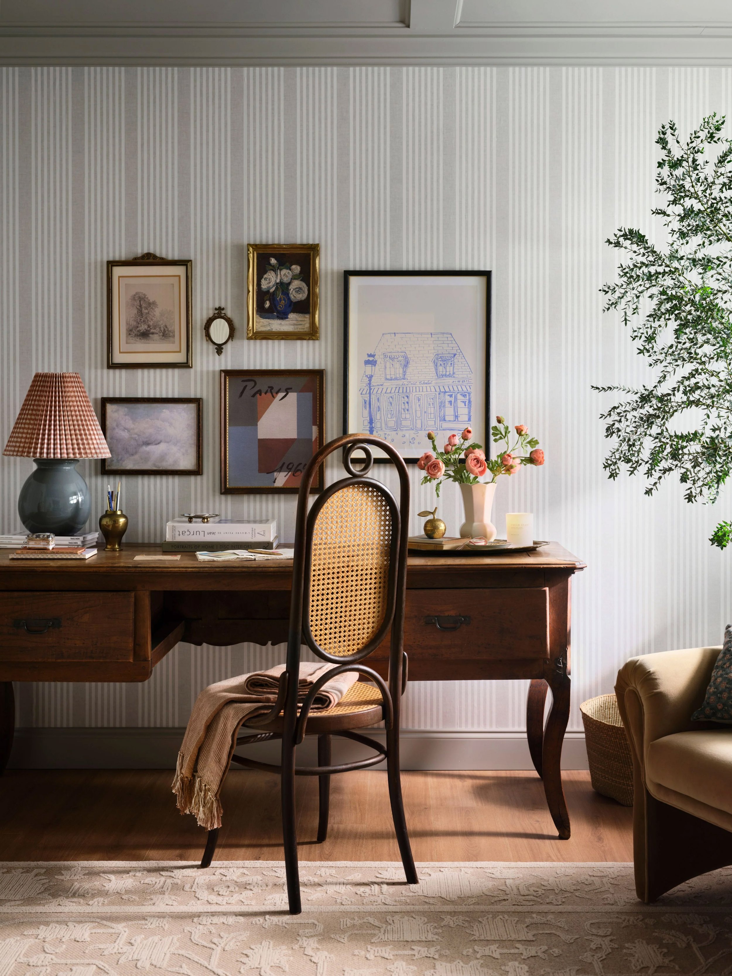
Hi, I’m Pascale! I’m a multidisciplinary artist working across stationery design, brand development, and illustration. At my core, I’m a design thinker: I bring brands and projects to life through creative problem-solving and storytelling that spark imagination and stir up whimsy and joy.
Selected Work

Client
Penguin Random House
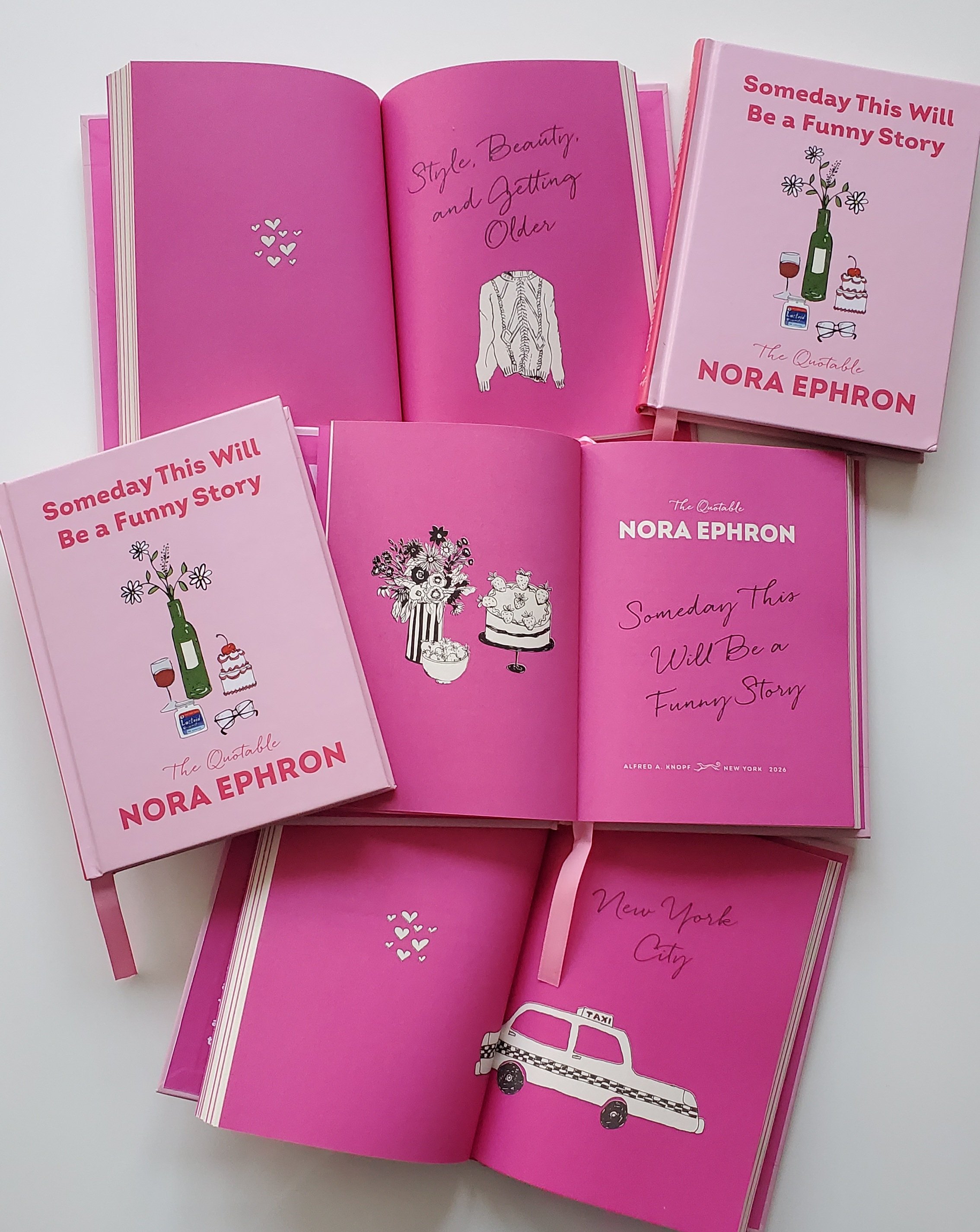
Someday This Will Be a Funny Story The Quotable Nora Ephron
For Penguin Random House, Pascale created the interior illustrations and cover design celebrating the best of Nora for every season of life. Pascale accompanied each section with an illustration that complements and celebrates Nora’s wicked sense of humor and shrewd intellect: classic New York taxi cabs, the iconic When Harry Met Sally cable knit sweater, good food, and small moments of everyday life. Hand-drawn dessert, wine, flowers, eyeglasses and the unexpected antacid adorn the cover design.
Rendered in loose black linework, the illustrations are a sweet reminder for those who miss her voice.
Confidential Client
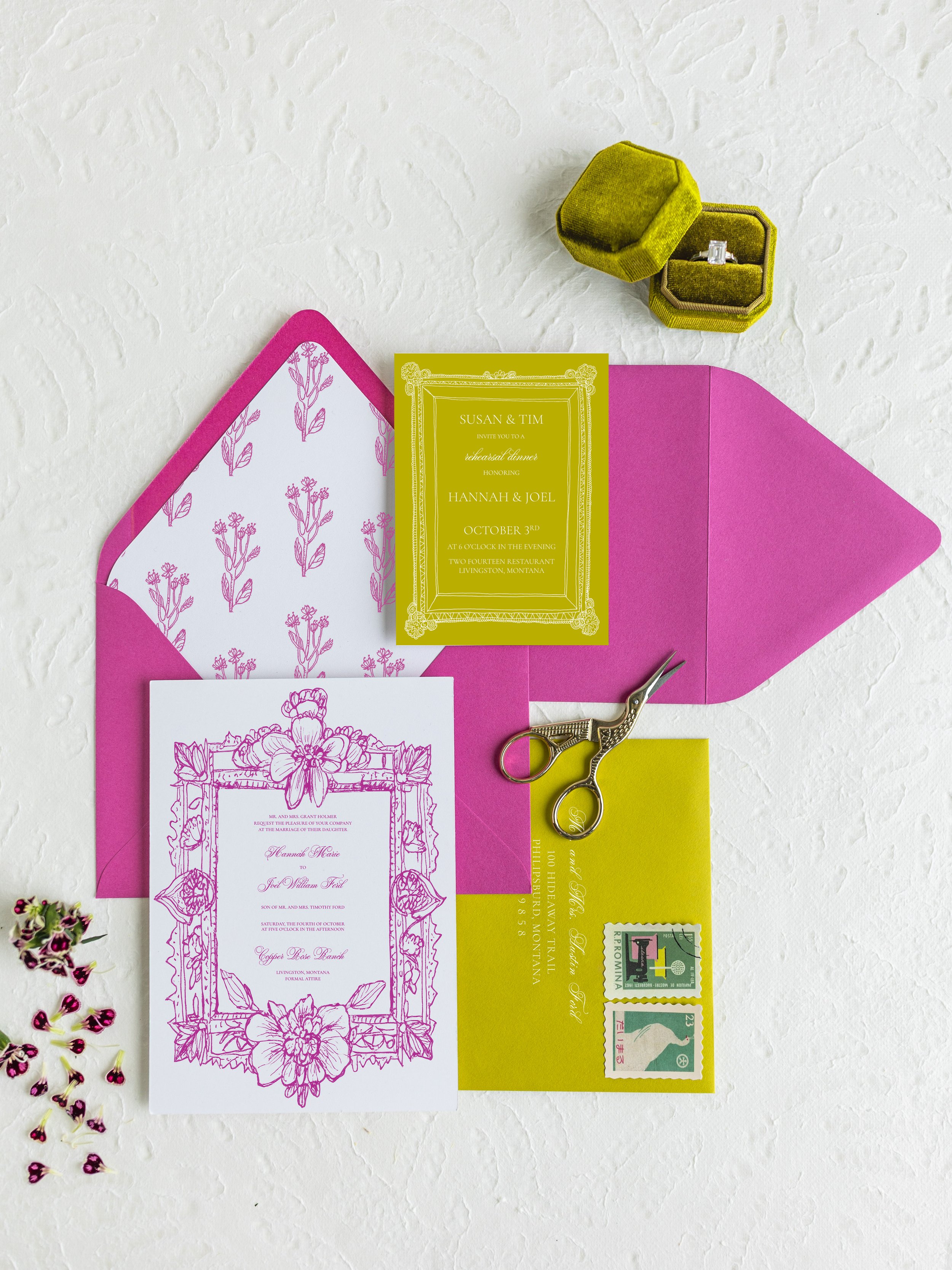
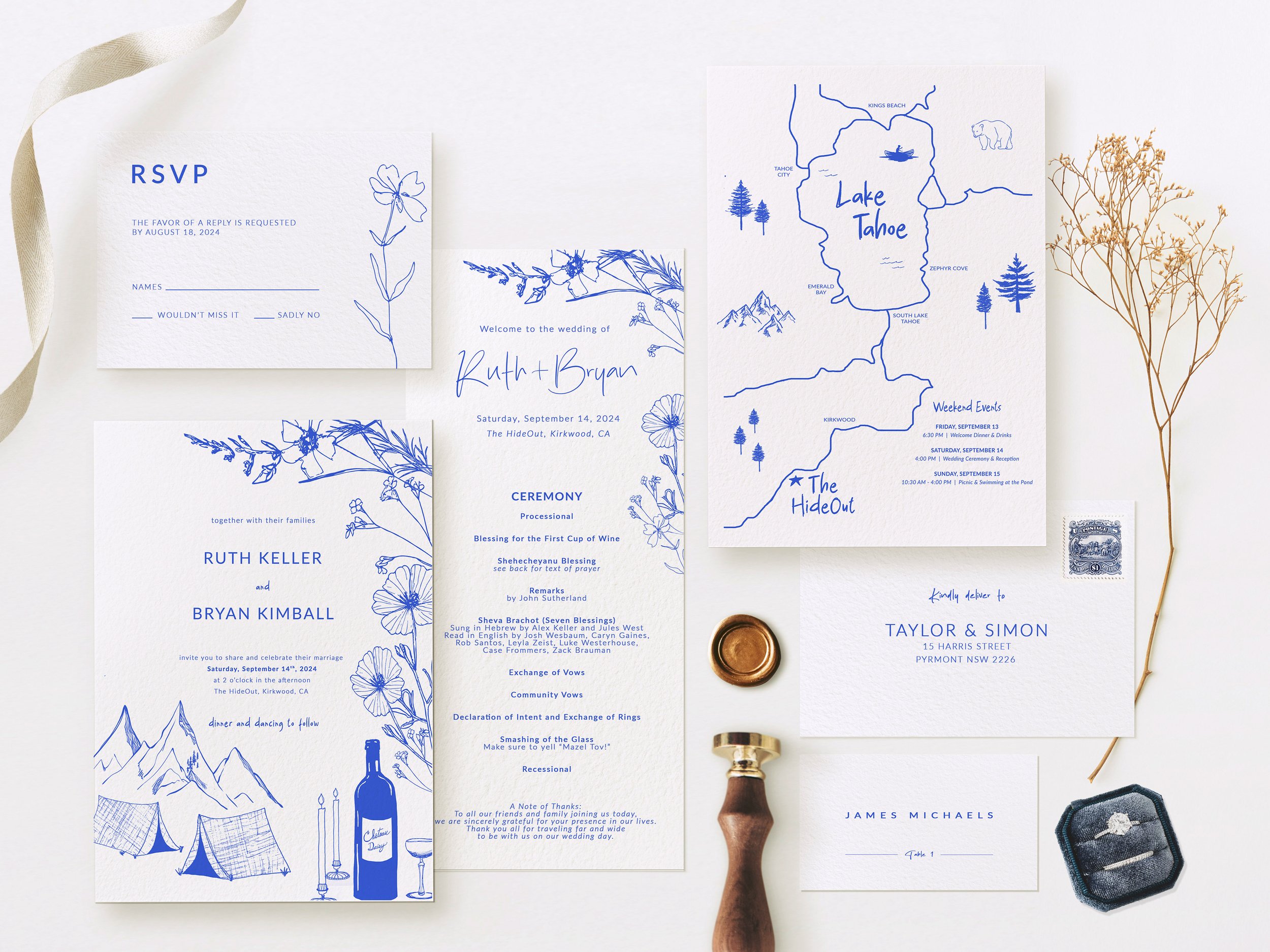
Wedding Invitation Suite with Custom Map
A Lake Tahoe wedding for a special couple with coordinated designs that features a specially made map, highlights their passion for camping, celebrates native wildflowers, and a nod to their dog Daisy on a custom wine bottle label.




Punchbowl and Lovebird
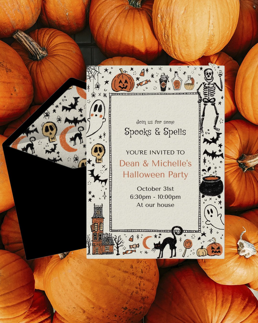
Online Invitations and Digital Greeting Cards
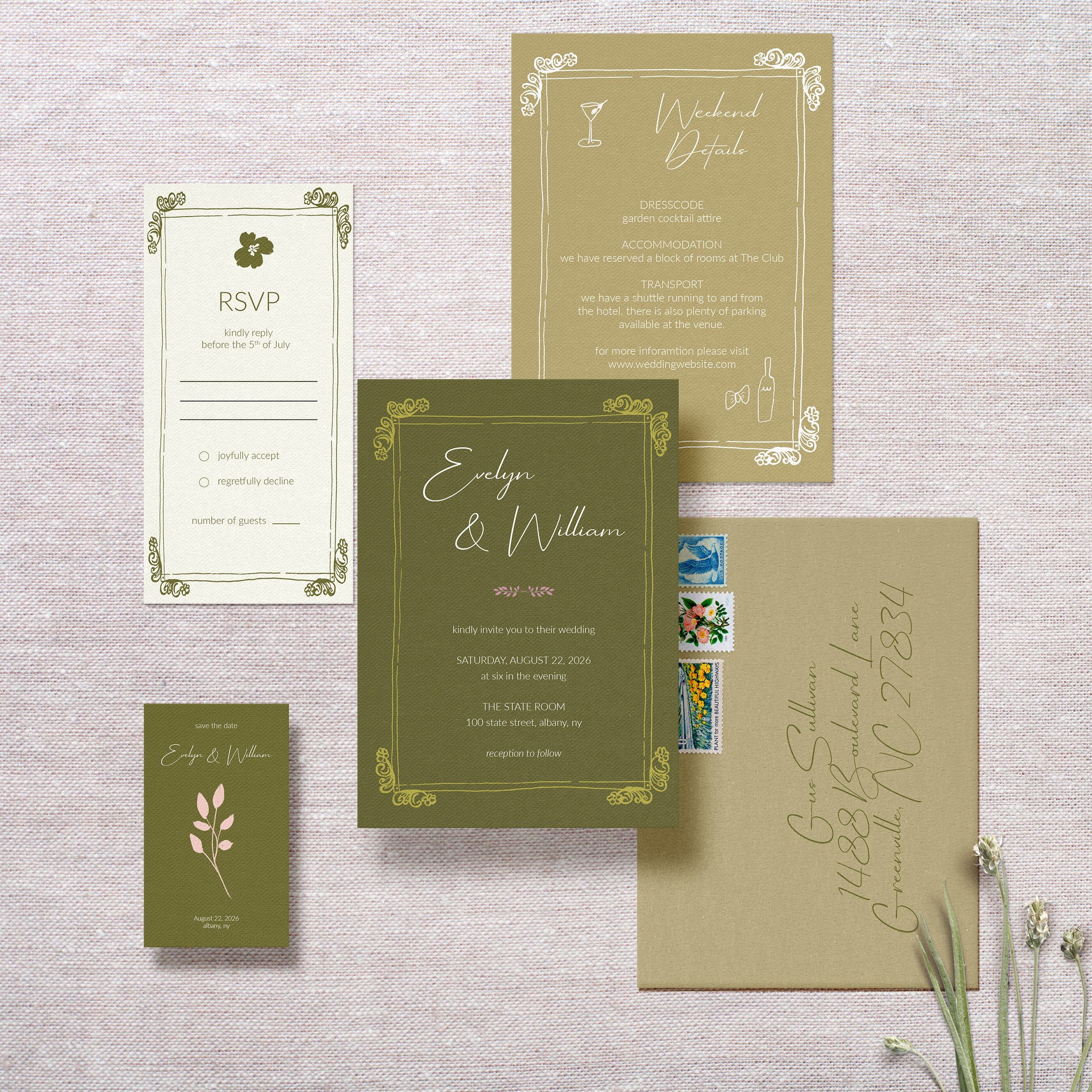
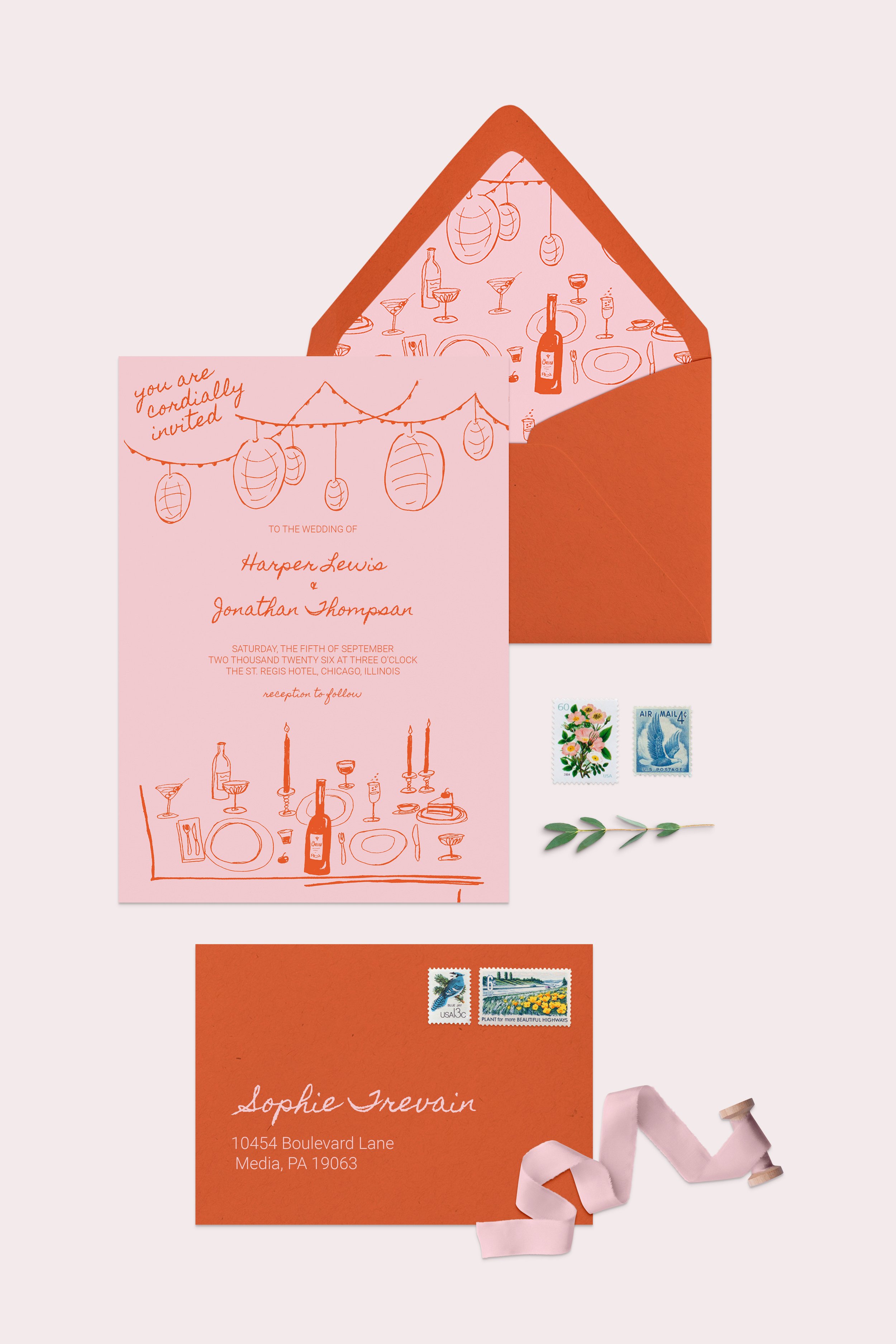
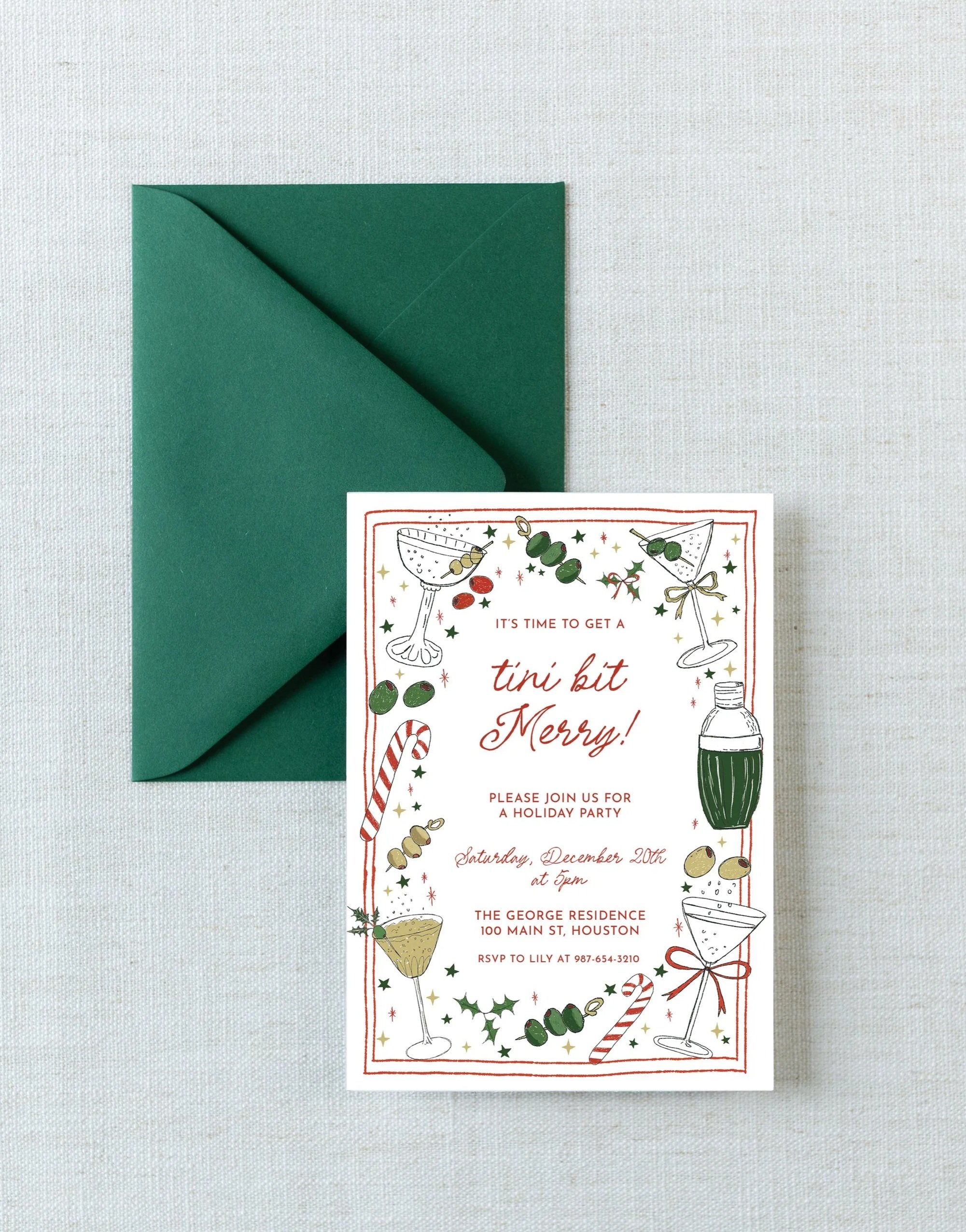
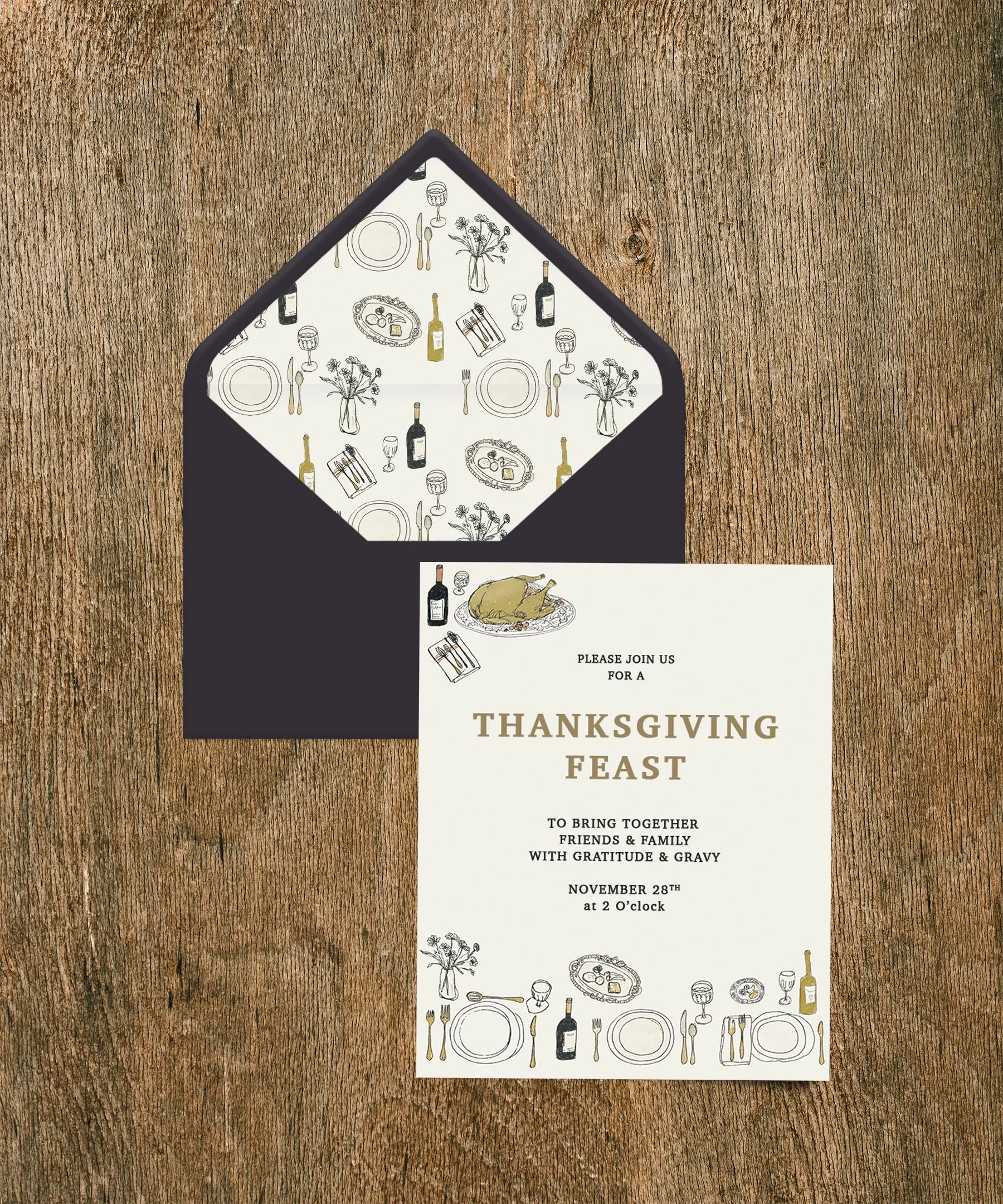
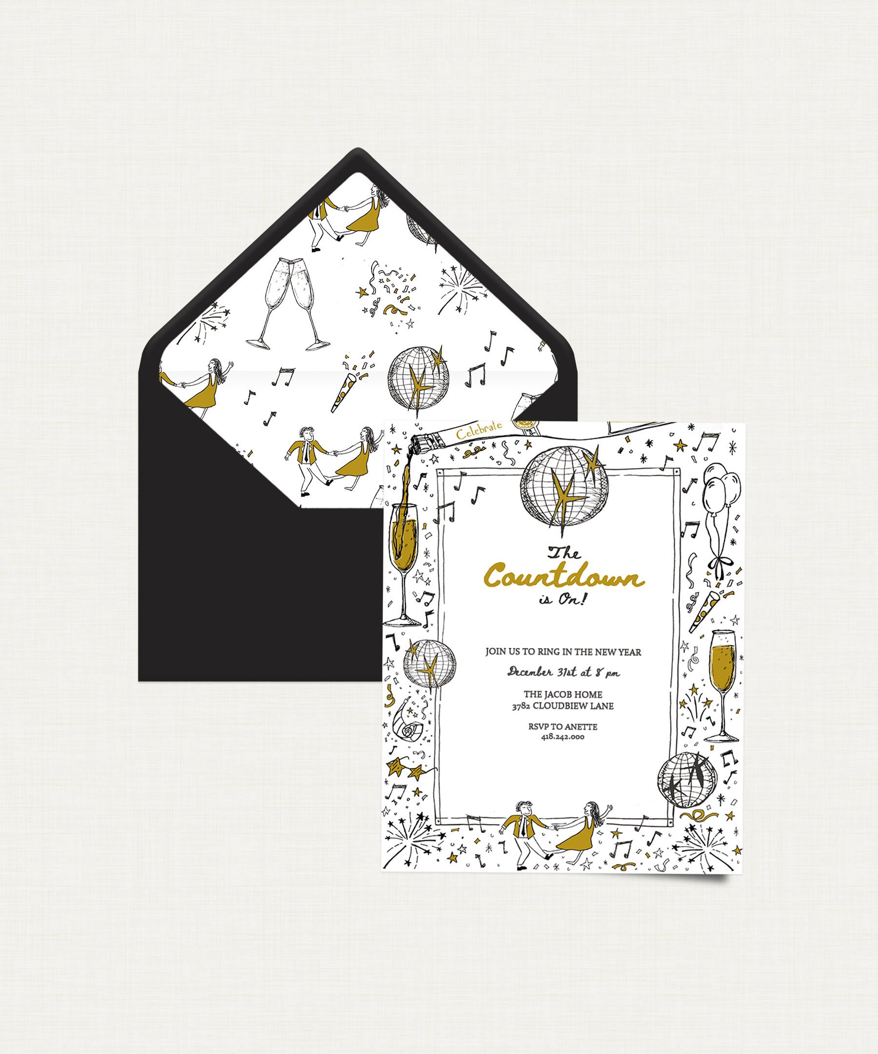
For Lovebird and Punchbowl’s online platforms, Pascale creates stationery, wedding invitations, pattern designs, and greeting cards. Her work centers on expressive, hand-drawn line art in her signature whimsical style, bringing warmth and personality to digital cards for weddings, birthdays, holidays, and everyday moments. Each design is made to feel handmade and personal, so a card sent online still feels like it came from a real person.
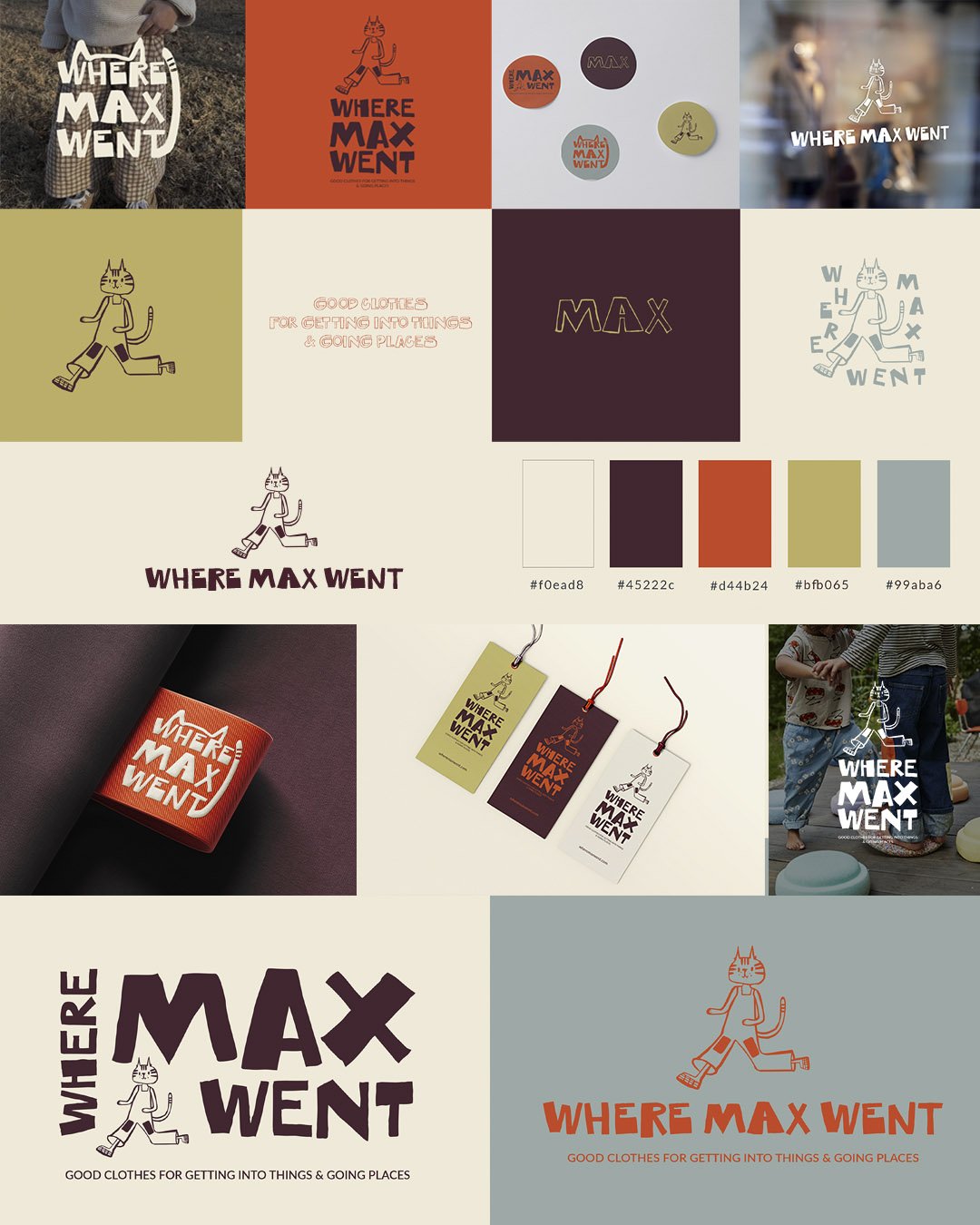
Where Max Went
Brand development for a children’s clothing line rooted in play, sustainability, originality, and childhood wonder. Together, we built a fully integrated brand: identity, character development, storytelling, and a collateral system that moves seamlessly across platforms, marketing materials, and the garments themselves.
The project began with a deep dive into earthy color palettes and illustration references, drawing on childlike wonder and the joy of hidden details. At its center is the Max the Cat mark: a human figure with a cat’s head, dressed in hand-me-down overalls with knee patches. Max embodies what Where Max Went stands for: well-made garments meant to be passed down, small-batch production with sustainability in mind, and adventurous play.
Shaping the identity and the overall experience was a true collaboration, resulting in a brand that reflects the creativity, care, and curious cat spirit behind Where Max Went.
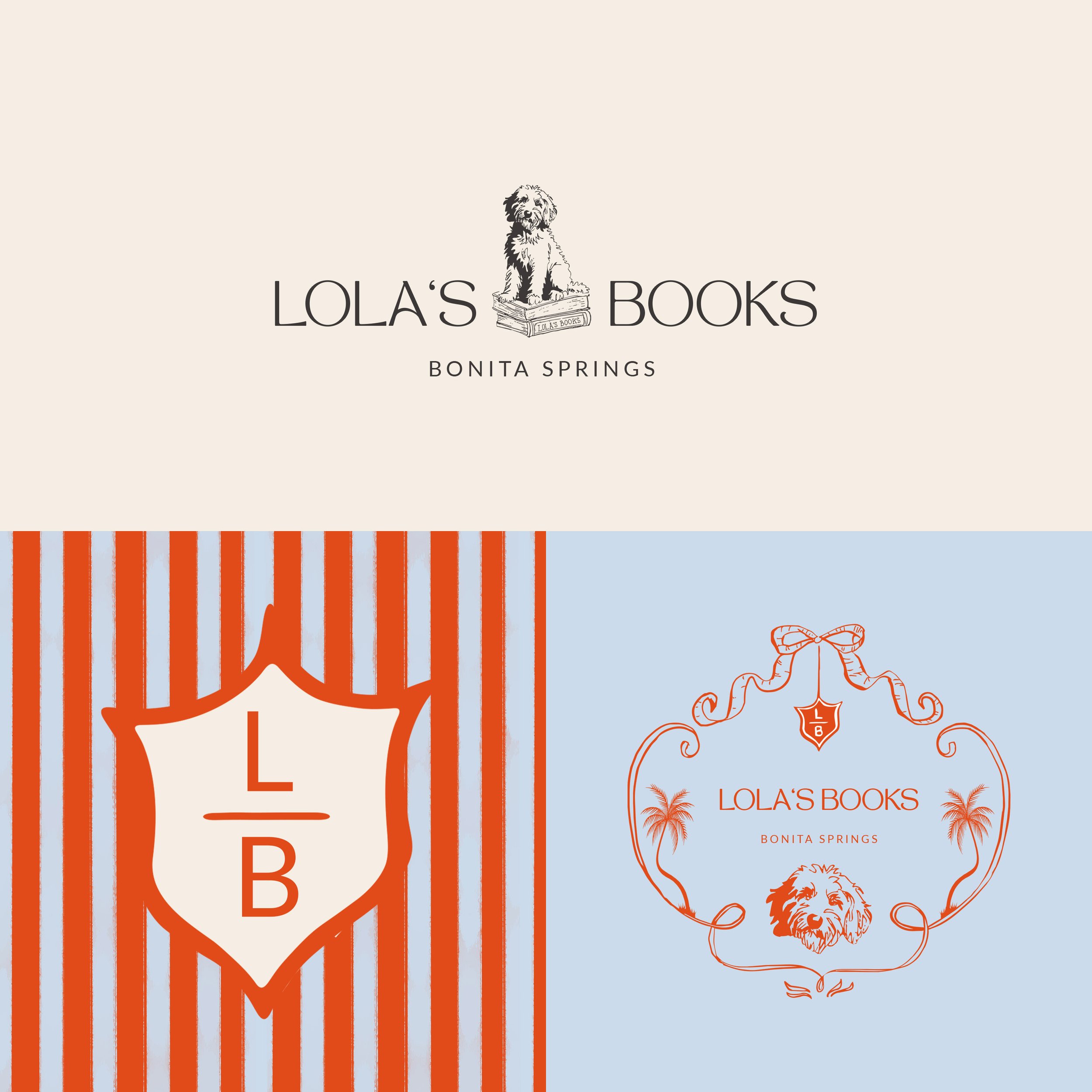
Lola’s Books
Brand development for a bookstore opening in Bonita Springs, FL, named after a beloved Aussie Labradoodle. The client brief called for an elegant, timeless feel with a relaxed, beachy spirit: somewhere you’d want to linger with a good book (and maybe a good dog).
Pascale achieved this by building the identity around hand-drawn illustrations of Lola herself. A classic serif-leaning wordmark keeps the brand refined and timeless.
An alternate logo wraps Lola in a ribbon-and-bow frame with palm trees on either side, a nod to the Florida coast, with a small “LB” crest hanging from the bow. That crest also works as a submark set against a bold, hand-painted stripe pattern, adding the coastal, cabana-style energy the brief asked for.
The result is a flexible brand system, from signage and bookmarks to packaging and social, that feels as welcoming as a favorite dog greeting you at the door.
Client
The Unearthed Creative
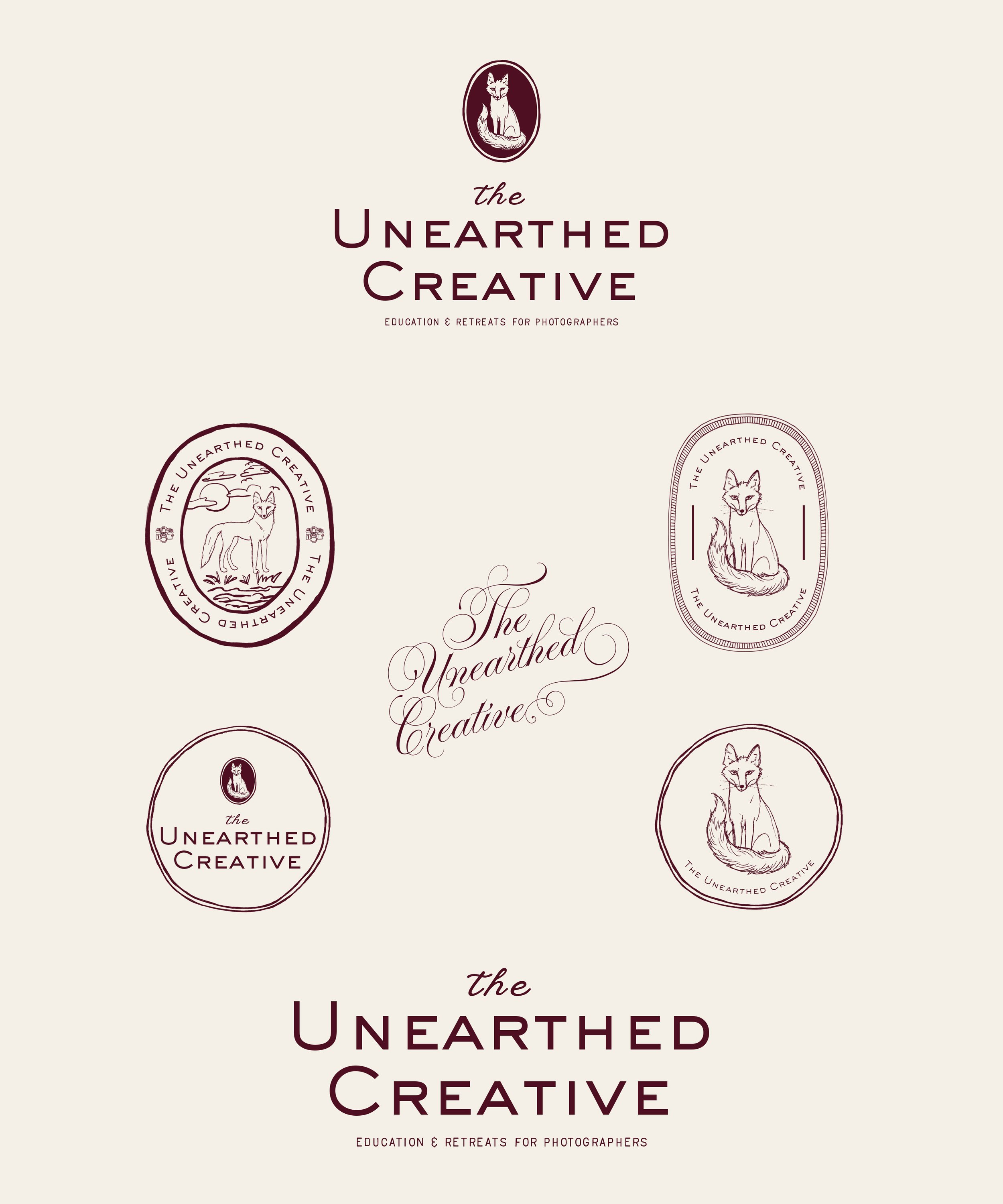
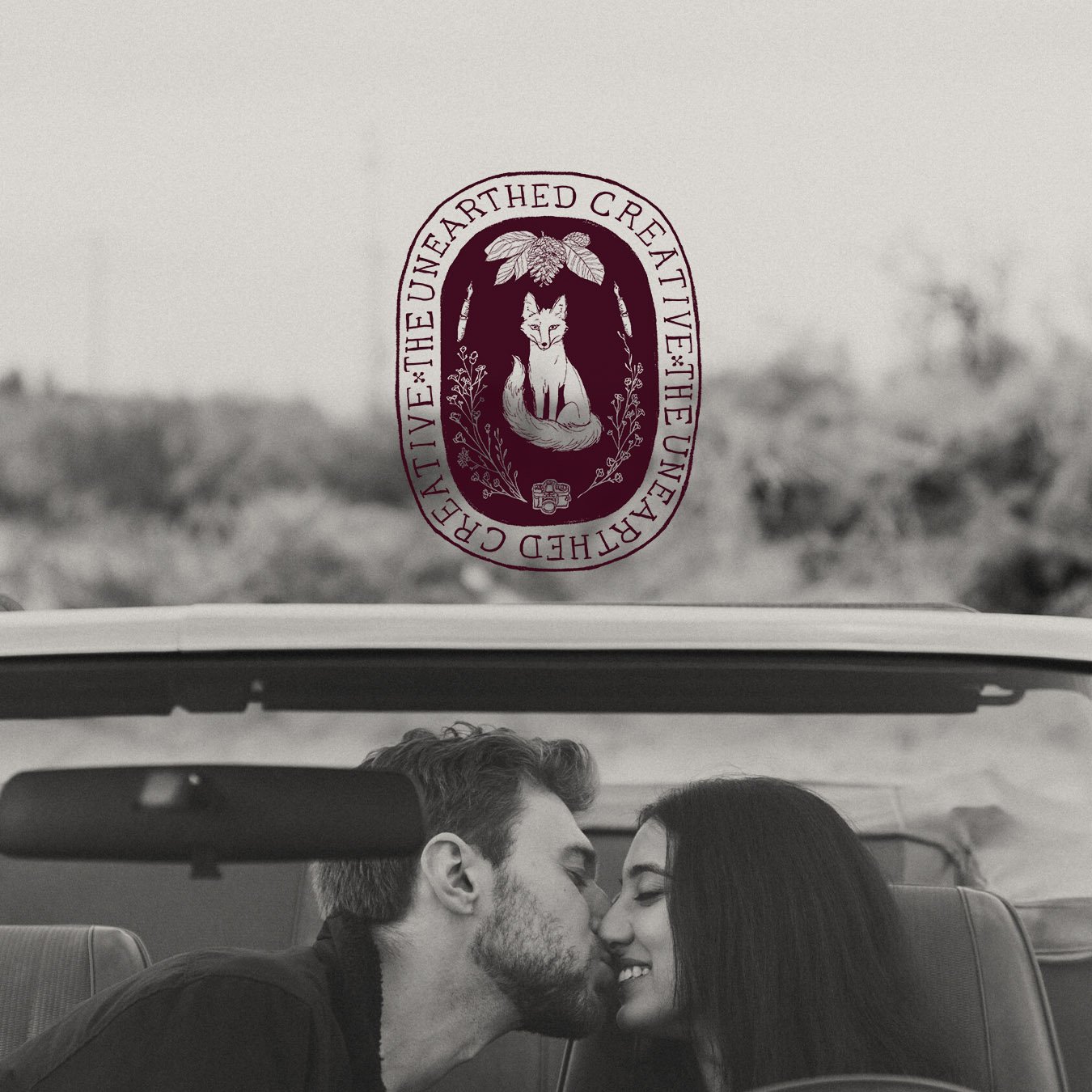
Brand identity for The Unearthed Creative, an educational space and retreat for photographers and other creatives to break through the noise of the industry and create meaningful work that is unique and life- giving. Defined by a historic and organic spirit that feels nostalgic, timeless and hand-made. The fox represents the unearthed, or digging something up. More broadly, the discovery of something that was hidden or lost. Through education, creative prompts and retreats, The Unearthed Creative provides a time to dig into yourself, to unearth your creative purpose, to reconnect with yourself, and to find balance.
Client
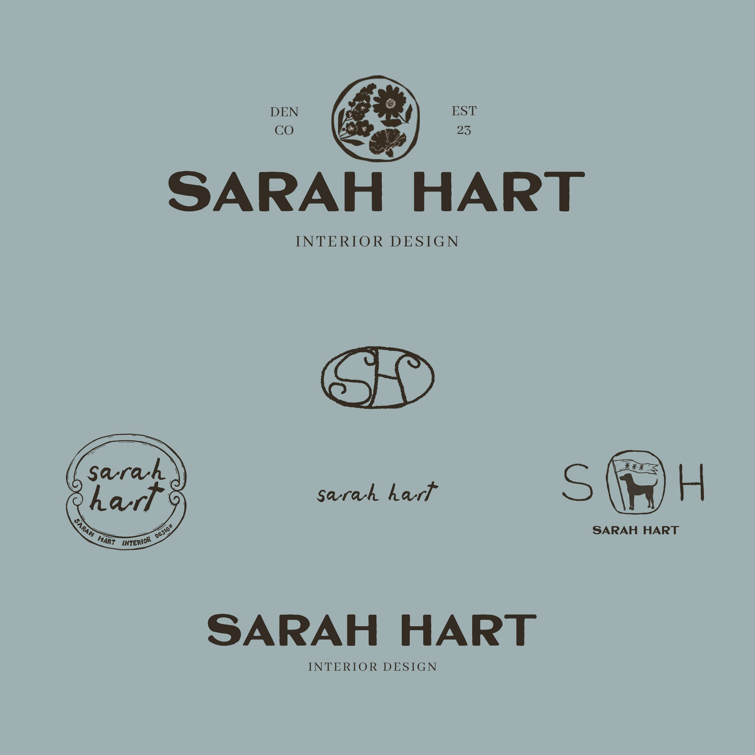
Sarah Hart Interior Design
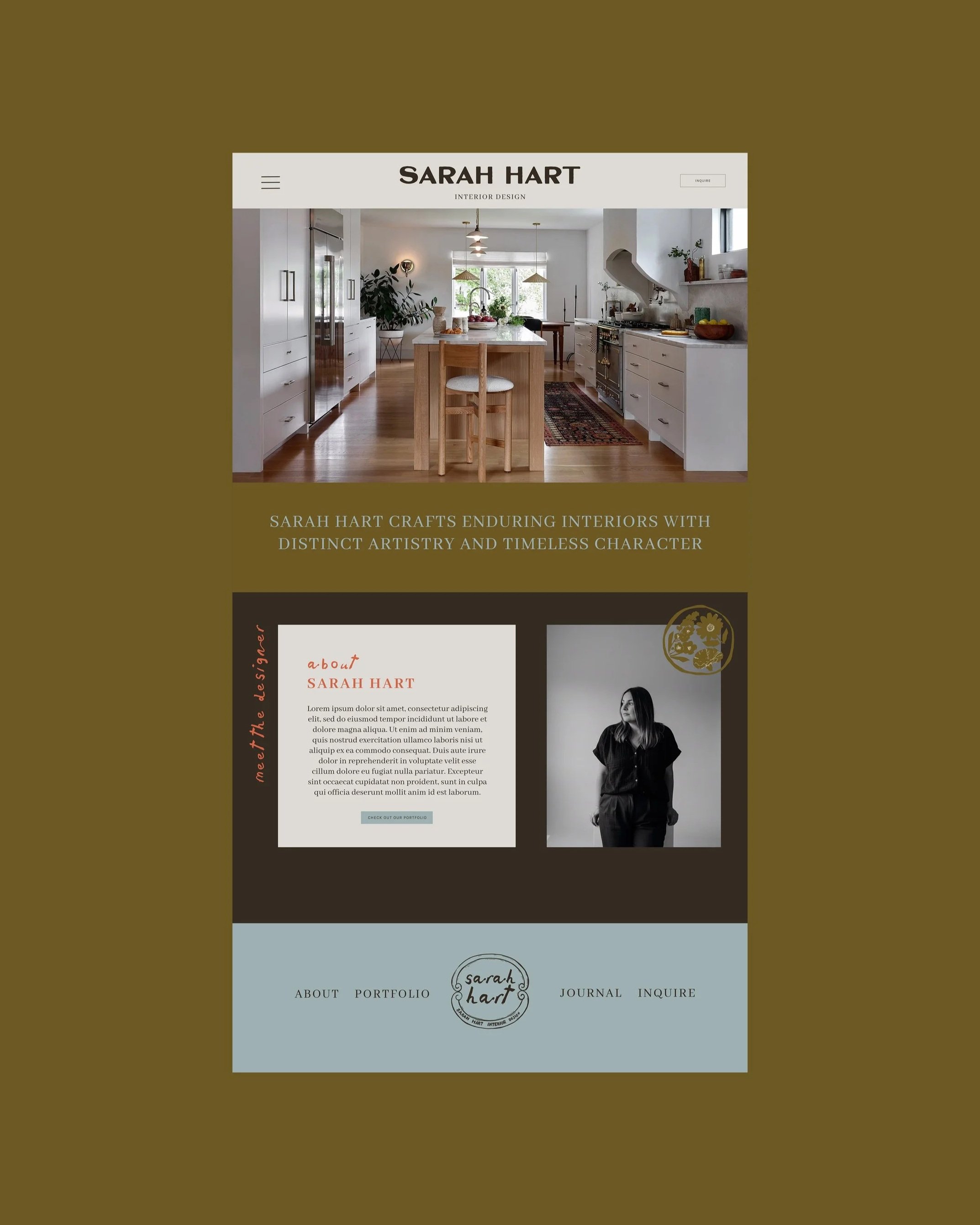
Brand development for Sarah Hart Interior Design, a full-service interior design studio in Denver, CO.
With a focus on texture, rich color, and artisanal details, every element was carefully considered to shape a brand that remains personal to Sarah. The suite features a custom pattern, three flowers representing her three children, and a nod to her beloved labrador retrievers.
The result is a flexible suite of assets that works across every touchpoint, tells a story, and celebrates human craft and beautiful design, all within an easy-to-use, comprehensive collateral system.

Client
Wicked Provisions
Wicked Provisions, a wine shop in Wellfleet, MA, came to me with a delightfully specific request: a French oyster mascot named Claude.
His shell, rendered in layered, textured linework, nods to Wellfleet’s famous oyster heritage. He works as a standalone mascot or paired with the Wicked Provisions hand-drawn wordmark, and translates easily to labels, tote bags, signage, stickers, and menus.
The result is a character who captures the shop’s spirit: a little cheeky, a little refined, and rooted in the Cape Cod coast with a French accent.
Client
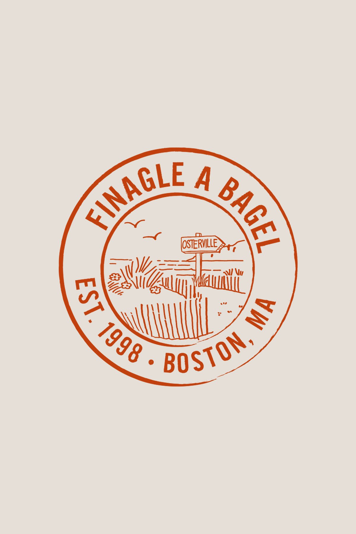
Finagle a Bagel
When Finagle a Bagel opened their newest location in Osterville, Cape Cod, they wanted something that felt connected to their established brand while celebrating the character of their new community.
Rather than reinventing their identity, I built on their existing logo by creating a vintage-inspired badge featuring an unmistakably Cape Cod scene. The goal was to create something that felt like it had always belonged there: familiar to longtime Finagle customers, but rooted in the charm and nostalgia of the Cape.
I love projects like this because great branding isn't always about starting from scratch. Sometimes it's about honoring what people already know and love while giving it a sense of place.
Client
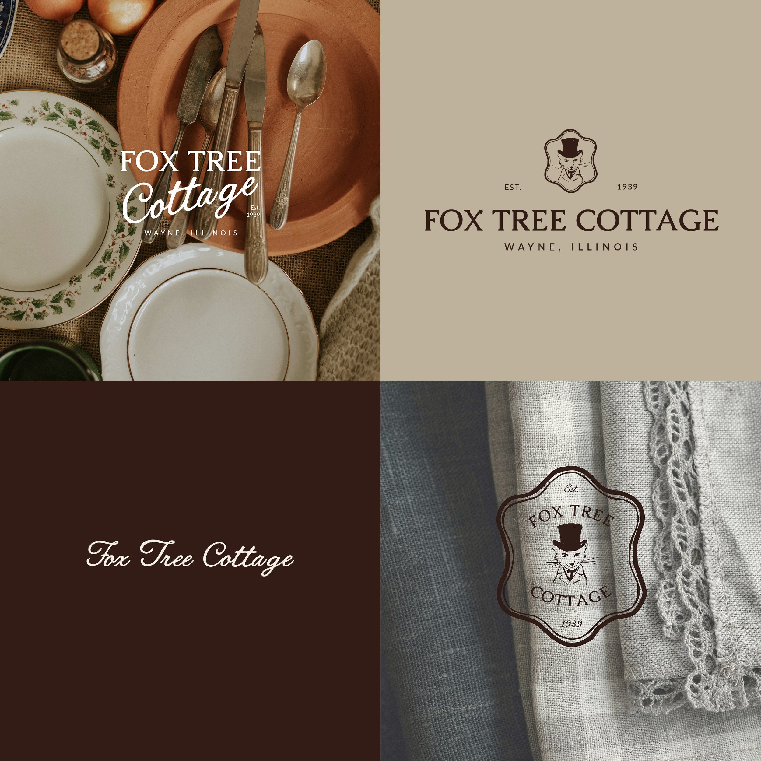
Fox Tree Cottage
A homeowner named her house wanting to bring joy to her family and every guest who walks through the door. The heart of the brand is a giant fox in a top hat, carved from an old tree in her yard, so I illustrated a fox to match.
From there it grew into signage, napkins, gift wrap, and more little details that make guests smile. Every piece is drawn by hand, because a place with this much heart deserves something made with heart.
Client
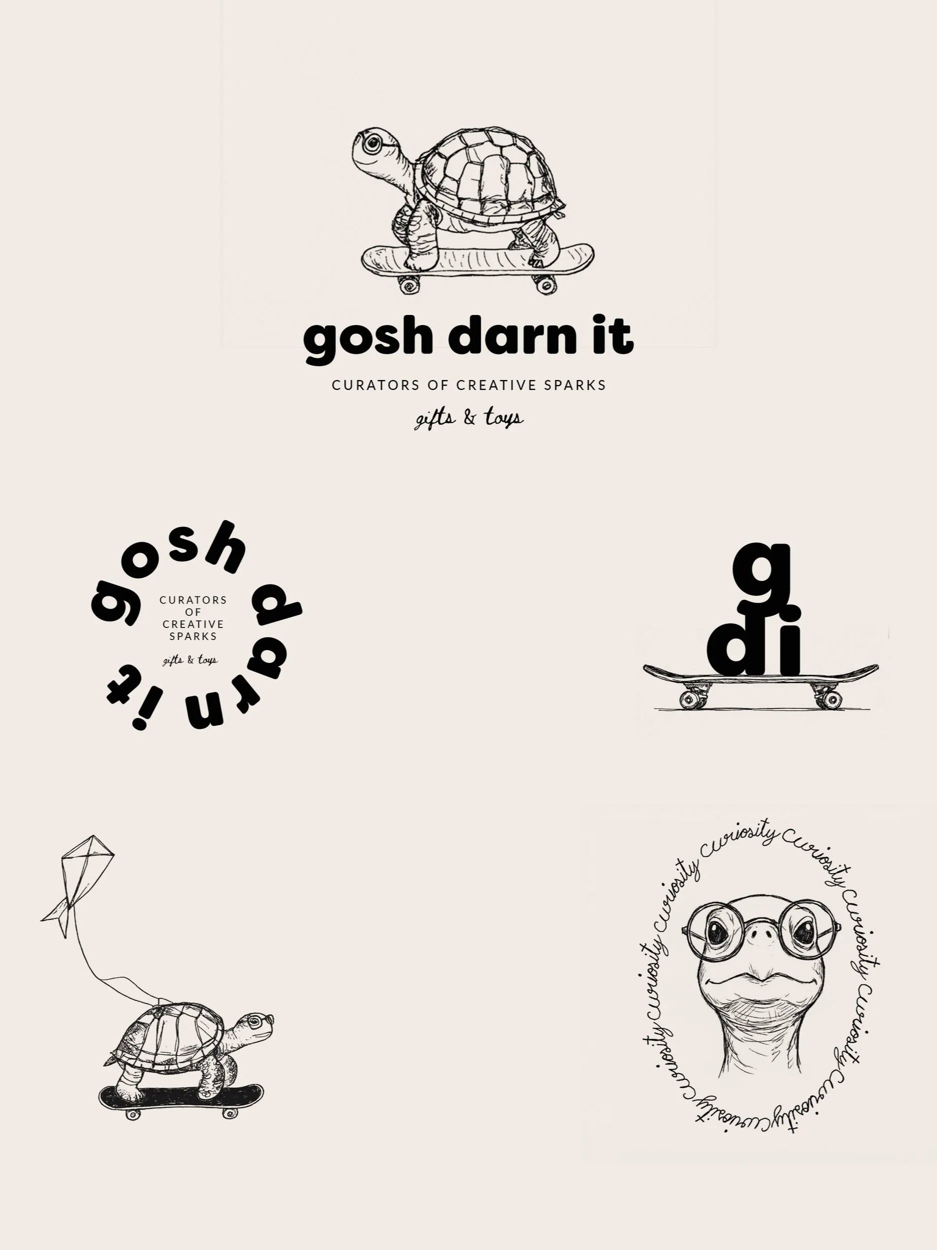
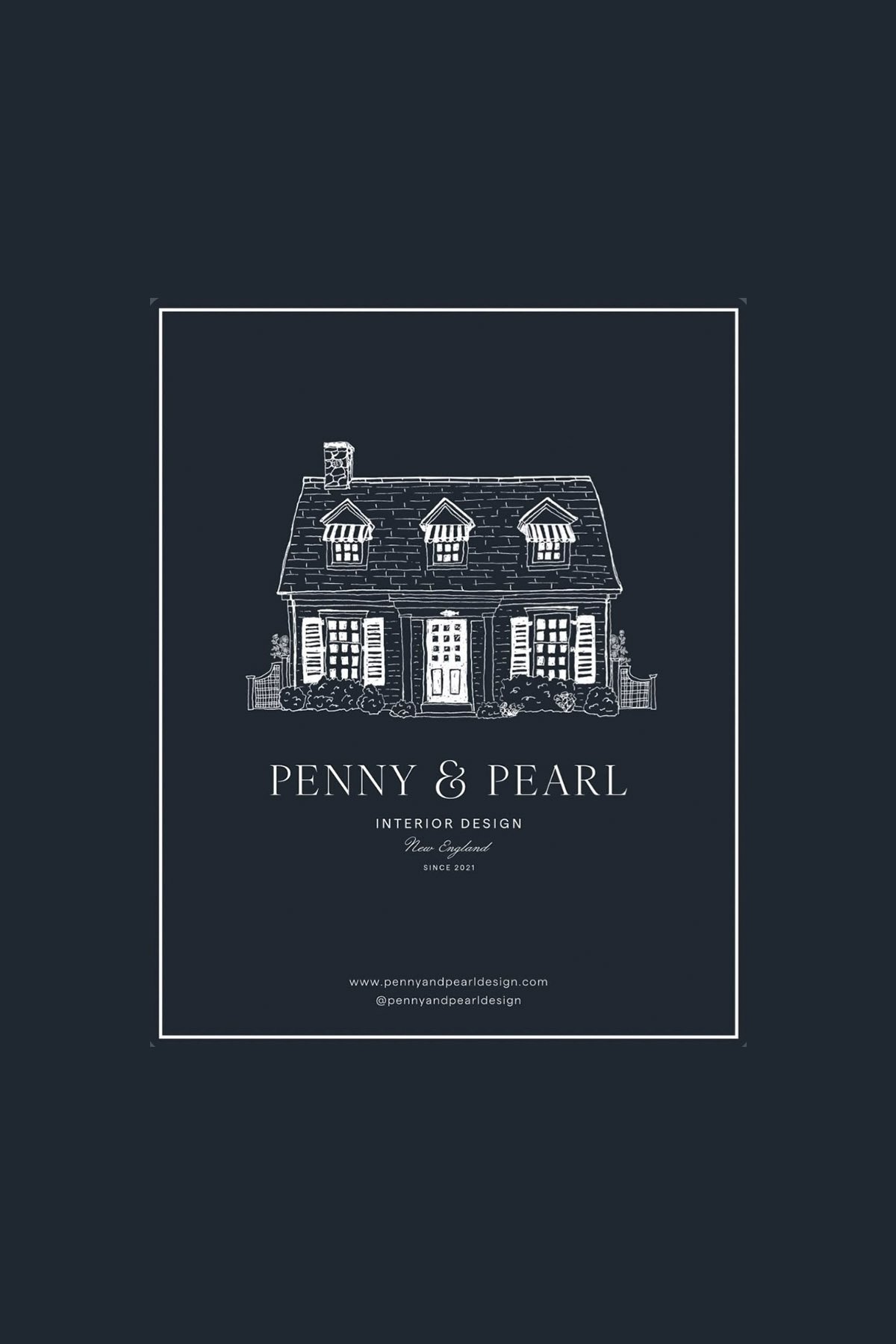
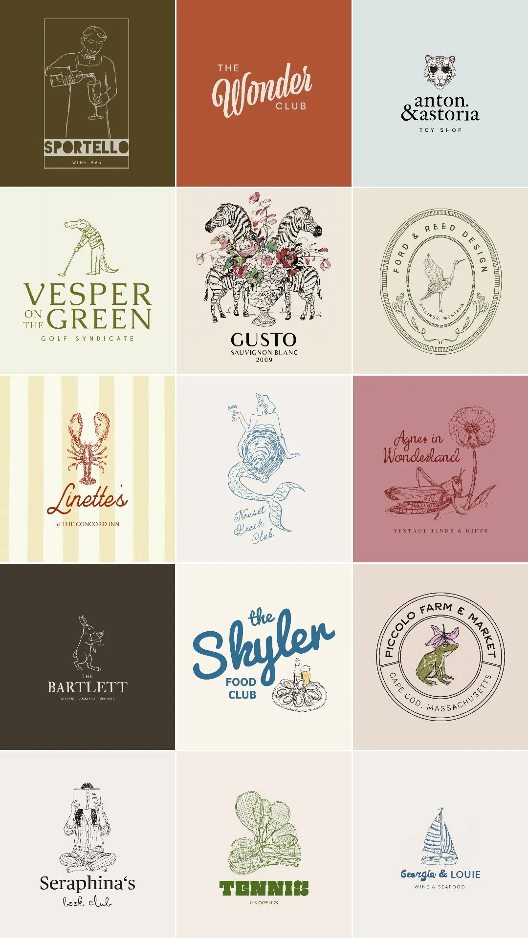
Selected logos, five years in the making.

Client
Sonoma Cottage
Brand identity for Sonoma Cottage: Unique Plant Arrangements and Interior Styling. The client brief focused on hand-drawn elements inspired by French cottages and English gardens, that feels like a place they'd want to step into and "just smile". That's the spirit I chased through every revision, resulting in a versatile and elegant suite of logos and a signature that is warm and full of old world charm.
Client
Pine & Plaid
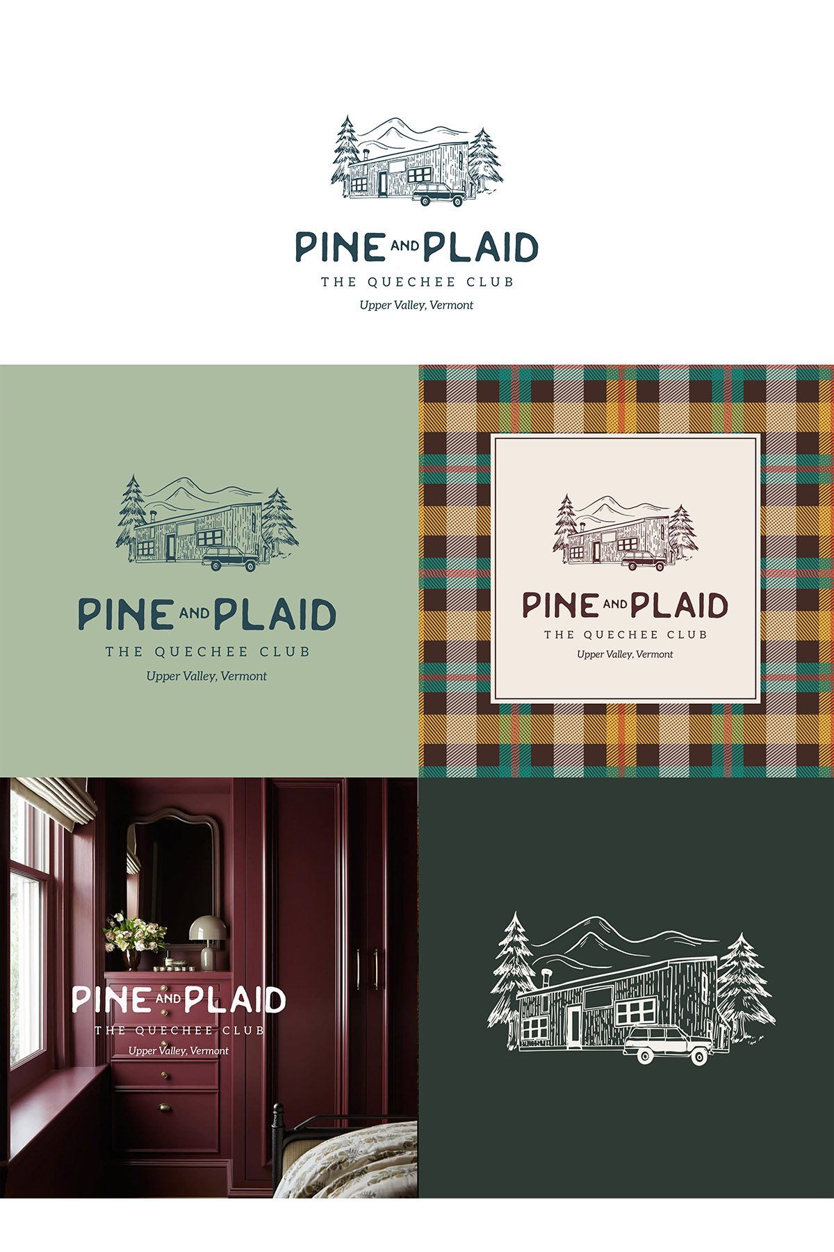
Pine & Plaid is a modern vacation cabin rental in Quechee, Vermont near The Quechee Club. Designed for year-round escapes, with easy access to skiing, golf, hiking, lake days, and Vermont’s iconic fall foliage.
The client wanted a custom logo that included an illustration of the home, lots of fun pops of color and mid century vibes.
Commissions
Bring deep meaning and unique character to your brand with intentional, artisanal design.
I create distinctive illustrations and brand identities tailored for retailers, restaurants, home decor labels, and women-owned small businesses. I balance high-end creativity with meticulous project management, ensuring a seamless experience and perfectly structured final assets.